Get more conversions with a few simple tweaks to your lead magnet landing pages and social posts
You know that lead magnets — especially in B2B space — can help you attract, capture, and convert quality leads. But this is what I see happen over and over with lead magnets: marketers spend weeks on creating beautiful, original, well-researched, useful resources… while treating landing page copy and social post copy as an afterthought.
If you’re doing the same thing, it’s costing you leads.
These common copy issues make your lead magnet look bad
1: Making it all about you
You’ve (finally!) hit “Publish” on your new resource — of course you’re proud of it! But don’t make your landing page or social posts all about your achievement.
Instead, give your prospects a reason to feel excited as well.
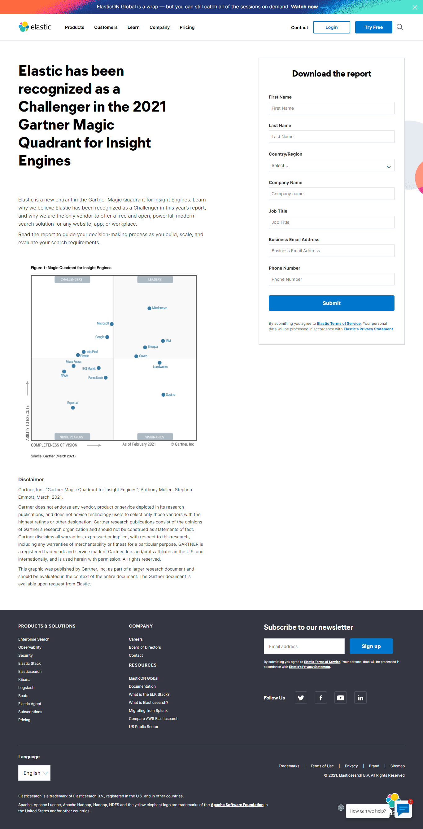
Example: gating a report about industry recognition (Elastic has been recognized as a Challenger in the 2021 Gartner Magic Quadrant for Insight Engines).

Landing page copy gives us a reason to care: “Read the report to guide your decision-making process as you build, scale, and evaluate your search requirements” —
LinkedIn post CTA (“Learn why elastic is recognized as a challenger”) would likely perform better if it was focused on prospects’ needs — finding a search solution.
Even then, I’d argue that gating that report is less effective than creating a “How to evaluate search solutions for {Industry X}.”
For one of my clients, we were able to 3x industry benchmark conversion rates by being very specific about the problem the lead magnet helps solve — and who it’s for.
2: Not providing details to prove that the lead magnet is worth the effort
One of the primary concerns of anyone considering downloading a lead magnet is: “Will this be worth my email address?” (right after “Will I have to field sales calls for the next 2 weeks?”).
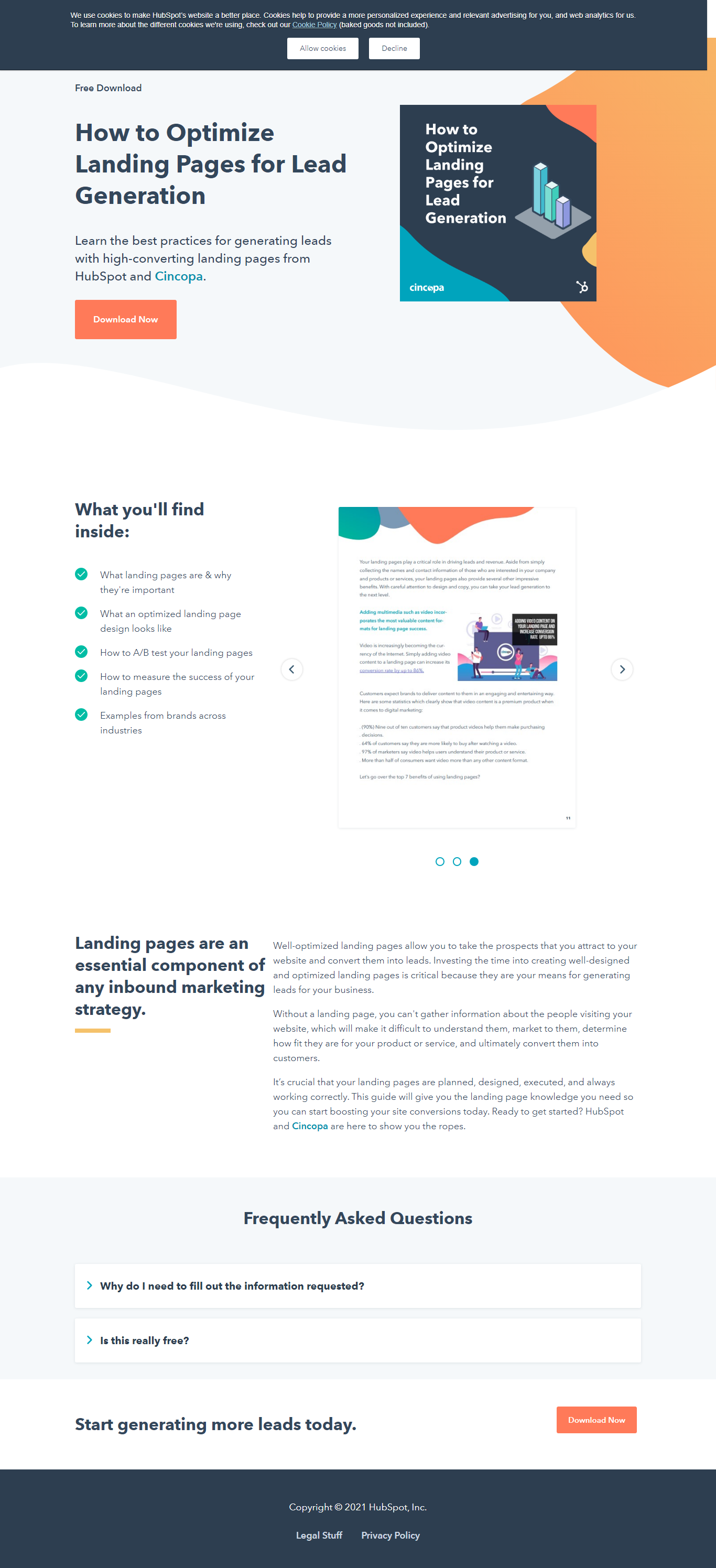
Instead of providing a high-level description, include both “What’s included” — and “What you’ll be able to achieve.” After all, your lead magnet exists to help your ideal customers achieve a specific goal.
Make it easier for them to convert by giving them a sneak peek and making your lead magnet look irresistible.
For example: this HubSpot guide includes both screenshots and a “What’s inside section.”

3: Being greedy about your customers’ data (cue form abandonment)
Remember the “Will I have to field sales calls for the next 2 weeks?” concern?
Is your form asking for your prospects’ ZIP code and their kids’ ages (kids’ events business), or your social security number (a local pharmacy vaccination sign-up form — I wish I was kidding!)?
If it is, prepare yourself for high form abandonment rates (some stats in this post).
Do this instead:
- Set up a thank-you page survey with a follow-up question
- Add a self-segmentation email to your lead magnet nurturing sequence, if appropriate
- Most importantly, before adding form fields to your sign-up form, ask yourself: “Do I *really* need this information at this stage of customers’ journey?"
Another question to consider: how much do your prospects trust you?
HubSpot’s content quality is well-known, so sharing your business email and company name seems like a no-brainer. But in some cases (looking at you, invasive kids’ events business newsletter form), your prospects will move on with their lives, leaving the form unfilled.
3 steps to get more click-throughs and conversions for your lead magnet posts and landing pages
Step 1: Consistent messaging across your funnel
Your ad and your landing page need to be aligned — otherwise, you’ll be confusing your leads!
Prepare the key benefits of signing up for your lead magnet in advance and center your social copy around them.
Step 2: Insider push-pull factors in your copy
Are you pushing away your leads — or attracting them by showing just how irresistible your lead magnet really is?
Push factors (aka landing page factors that increase friction and make conversions less likely) are:
- Long forms
- Lack of clarity
- Features-focused copy (as opposed to highlight the benefits of getting your lead magnet)
- Boring CTAs
- Lack of credibility signals
Pull factors:
- Shorter forms
- Clear, compelling copy
- Copy focused on benefits
- Conversion-oriented CTAs
- Credibility signals, from author / speaker bios to testimonials
Step 3: Keep improving with feedback loops
Having feedback loops in place is nothing short of magical (I may be prejudiced here).
By tracking what your customers are hoping to achieve (or learning more about them), and their post-download behavior (from nurturing sequences open and click rates to engagement to content consumption) you not only learn more about the types of leads that this particular lead magnet is attracting, you’re also improving your copy and promotional angles.
Summary: get the most out of your lead magnet creation efforts by optimizing your social posts and landing pages to convert, not just inform
To recap, don’t let your lead magnets wither online without getting consumed — focus on helping your leads see the value of sharing their contact info with you, create strategic feedback loops, and make each line of your copy all about pulling your leads in, not pulling them away.


